If you've visited the Performance Platform recently, you may have noticed a new link in the header:
The prototypes page is a place where the performance team can host unsupported, experimental approaches to data analysis and visualisations. It's the result of work the Government Digital Service (GDS) is doing with colleagues in the Cabinet Office and the Government Office for Science to show the value of new analytical techniques in answering policy questions. This blog post has more details on the motivation behind the project.
The page is pretty unique for GOV.UK and comes with an associated disclaimer:
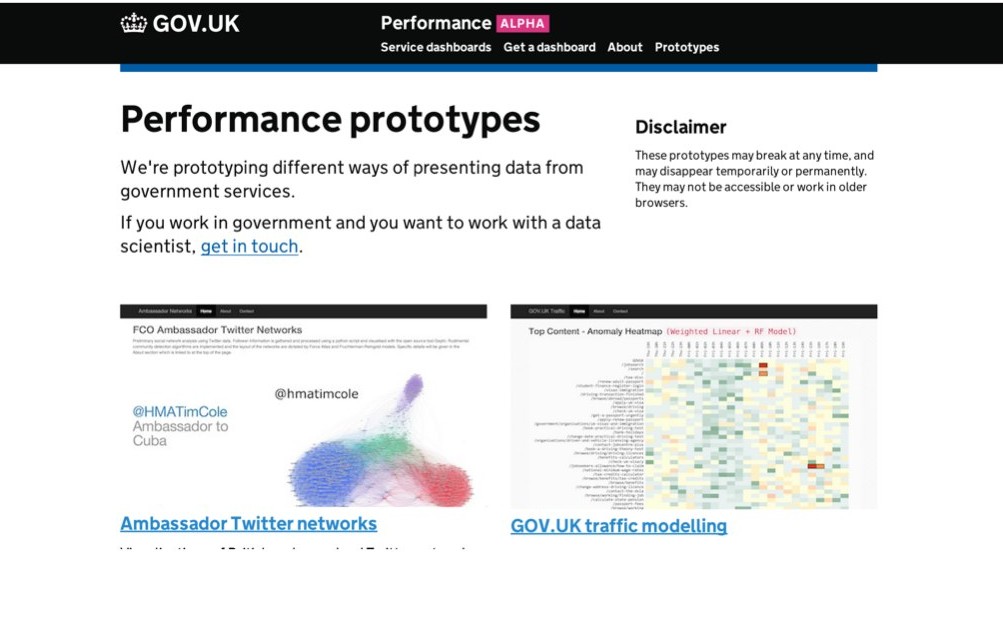
Over the next few posts I'll introduce a few of the prototypes that currently live on the page and give some brief technical details behind their creation. In the meantime, feel free to explore the page, and be aware that you'll get the best experience using Chrome, Safari or Firefox browsers.
Visualising river levels
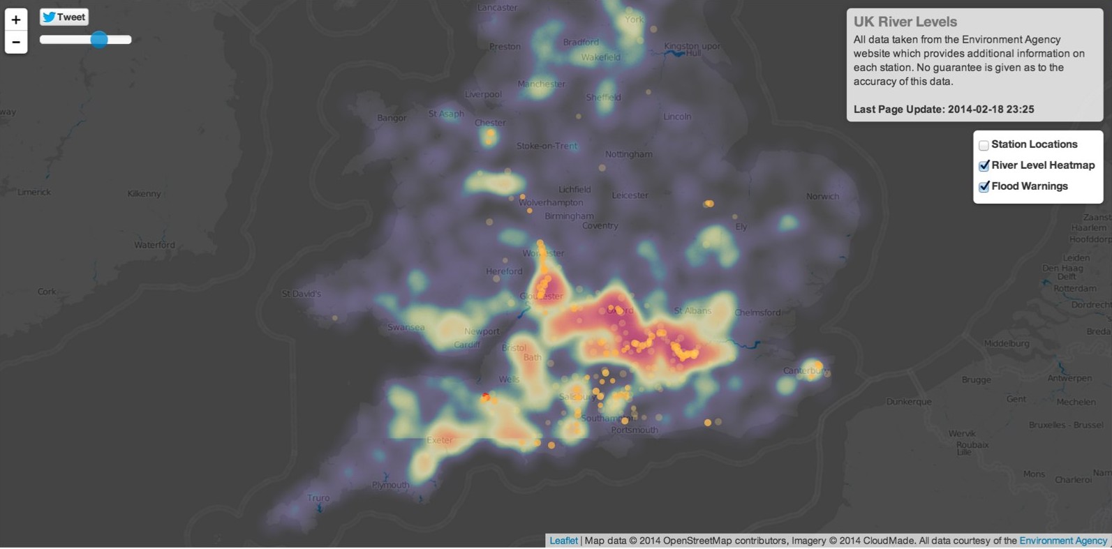
One of the first prototypes to go live and was created way back in January before the serious flooding across large swathes of the UK. At the time, the communication of near real-time data from the Environment Agencies 2000+ river sensors was less than ideal so I began looking at new ways of collecting the data, and presenting it in a more user friendly way.
In its current form, the visualisation brings in data from the Environment Agency and Met Office to highlight areas of potential flooding. The river level sensor data is refreshed every few hours while the precipitation forecast is available through the Met Office DataPoint API updates.
The image below was taken back in February during a period of unseasonably wet weather and helps illustrate the severity of conditions at the time.
The river level visualisation is built using open source infrastructure with Leaflet and Mapbox used to handle aspects such as the geocoding of weather warnings, station locations and the base map itself. It's hosted by the cloud platform Heroku and is built using the Python microframework Flask. The code for communicating with the Met Office application programme interfaces (APIs) is written in Python, with data stored in a NoSQL Mongo database. We'll make a lot of this code available in Github shortly.
The use of these open-source tools has resulted in a fast turnaround time for such prototyping and removes the complexities associated with procurement costs. The tools are well documented with numerous tutorials to be found across the web.
Achieving change
The widespread flooding at the beginning of this year brought a user need for accurate, frequently updated river level data. This gave rise to February's Flood Hack and fed directly into the cross-government work we've been doing to better address the handling of data relating to national emergencies. An open-minded and flexible approach to addressing problems has been an important element in helping us achieve what we have so far.
In the next post I'll continue this brief tour of the prototypes page, highlighting a collaboration with the Department for Communities and Local Government focused on fire brigade data.