This post describes how techniques like changepoint analysis and sentiment scoring can be used to identify potential problems in a service.
Problems such as an unexpected surge in demand can catch a service out. When a service fails to deliver for a customer then that creates a failure demand. Failure demand is when a service doesn’t provide the expected result for a customer. Such failures mean that the customer is likely to be unhappy and might make a complaint. We’ve previously talked about the opportunity to use failure demand to improve services.
Across government services, complaints are handled in bespoke ways by departments. This makes it difficult to obtain the data relating to these complaints. So when the data isn’t easily available, can we identify when a service is experiencing an unusual amount of demand?
One solution is change detection – also called changepoint analysis. This method has been used in econometrics, manufacturing quality control or even identifying changes in patterns of animal movements.
Applying changepoint to find changes in user demand
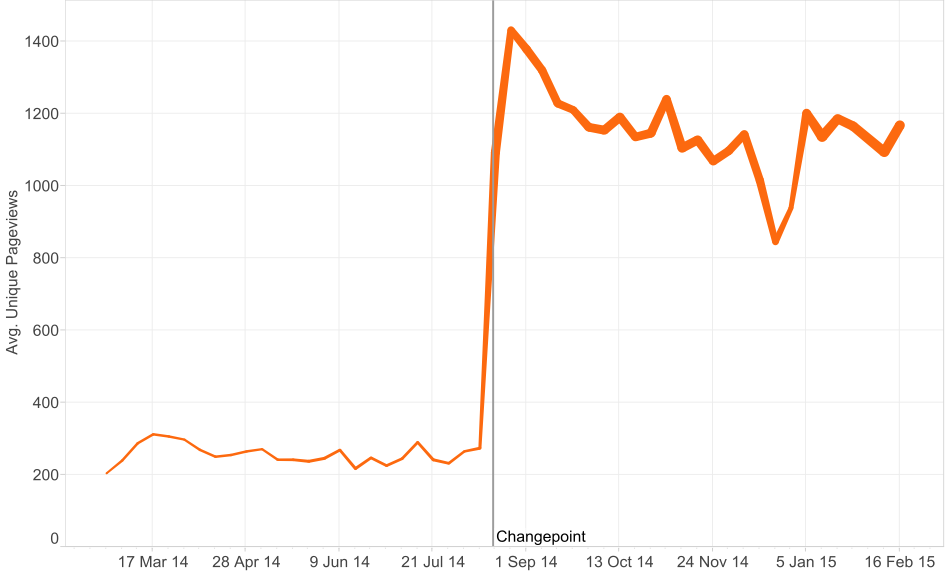
Let’s look at the example of the Land Registry. If we plot the average unique pageviews of the main pages that deal with Land Registry services, we can see a fairly major jump in pageviews in August 2014. This corresponds with an increase in the number of pages available, which is shown by the thickness of the line. Using a changepoint analysis package (in this case the recently released BreakoutDetection R package) we see 18th August is the most significant change in the median pageview distribution.

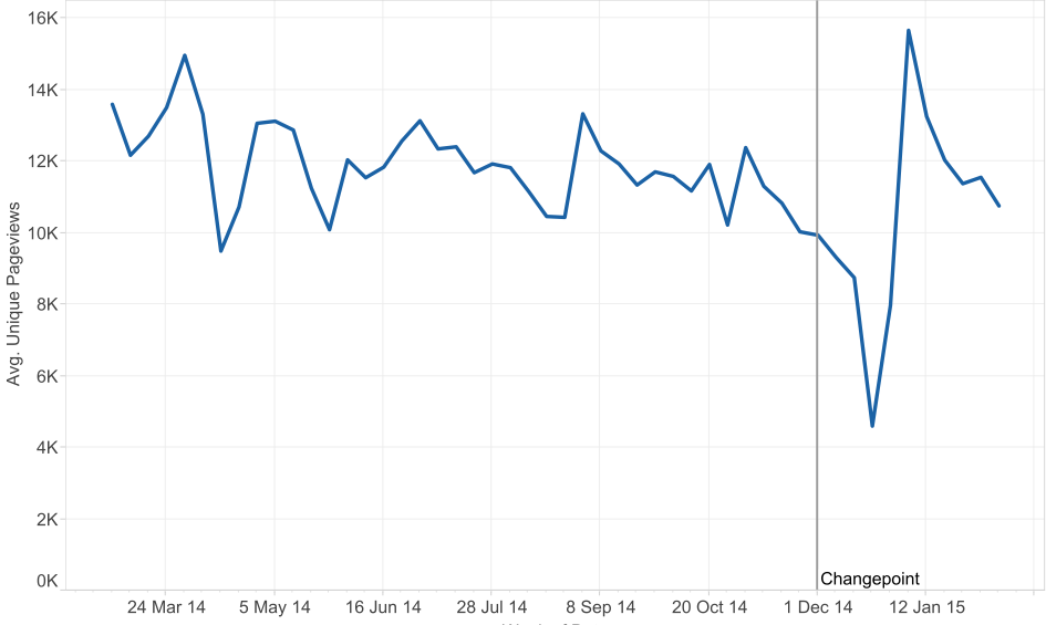
Now let us look at a slightly more complex example. The Jobseekers Allowance (JSA) pages are more consistent as they have been available for the whole of last year. This will remove the effect seen in the Land Registry data where the increase in pageviews was linked to an increase in the number of pages.

In this case we can see that the JSA average unique pageviews per week show a dip at the start of December. We know from previous experience that the overall pageviews for JSA dips at Christmas. After accounting for seasonal trends like this, the changepoint algorithm finds the most significant change in demand at the end of November. So in this case, changepoint analysis has identified a fall in demand.
Combining user behaviour with user feedback
Now that we can detect significant changes in the demand for a service, we want to augment this insight with user feedback. For example comments made from the open feedback link at the bottom of every page on GOV.UK. The ‘Is there anything wrong with this page?’ link captures two comment fields asking for ‘What you were doing’ and ‘What went wrong’ along with details like the page that the user was on. This is really useful information for us to understand issues that users are having.
This text data is hard to easily understand when viewed across a large number of pages. So for this we need to take a Natural Language Processing (NLP) approach. NLP techniques take human (natural) text and use a computer process to extract meaning. In this case, we are going to try and understand the comment (in this case referred to as a ‘document’) the user made by defining the overall sentiment of the comment.
Scoring user feedback by sentiment
Sentiment analysis takes a document of text and defines the overall polarity of the document. The document polarity calculation results in a score between -1 and +1. For example, if someone says ‘I hate this’ then the comment would be given a score of -1 and if someone says ‘I love this’ it would score +1. The scoring can be done from two approaches, lexicon-based or model-based. In this case, we will use a simple lexicon-based approach using the combined sentiment tagged lexicons of Harvard General Inquirer, AFINN and Bing Liu. This takes the list of words in each document and classifies the word as positive or negative if it appears in a positive or negative list in the combined lexicon. By counting the number of positive or negative words we can define whether or not a sentence can be classed as positive or negative. The resulting sentiment score for each document can then be analysed at an aggregated level.

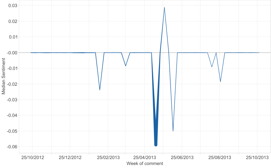
In the example graph of comments made on JSA pages, we plot the median sentiment on the y-axis and date of the comment (aggregated to week) on the x-axis. We vary the width of the line by the number of comments made. This shows how the user feedback becomes noticeably more negative around the middle of May 2013 in conjunction with a spike in the number of comments made. If we look at the details of the comments of this time, many relate to users finding a system error when making a new JSA claim. Users were typing in words like ‘error’, ‘fault’ or ‘problem’.
Now we have established a sentiment score, we need to divide the comments into groups by identifying the topic of what a user was giving feedback about. This topic identification is the focus of this work now – look out for it in a future blogpost.
3 comments
Comment by Andrew Robertson posted on
This is really interesting. Can you clarify how sentiment analysis will work for the 'is there anything wrong with this page' feedback? Aren't you inviting only negative comments just by the way the link is worded? I've not yet seen any comment that is praising the page left on that link; it's always a negative feedback as there is a problem to fix.
Comment by Dan Heron posted on
Hi Andrew
Thanks for your comment. Sentiment analysis is usually about understanding the full range of sentiment from positive to negative. However, in this case we are interested in spikes in negative sentiment as this may highlight a significant problem.
We have been thinking about the question wording but no changes just yet:
https://designpatterns.hackpad.com/Provide-feedback-XnFZG1honoO"
Dan
Comment by Bret posted on
Brilliant