In my role of analysing the performance of GOV.UK I often work on projects that involve complicated data sets with numerous dimensions and measures. This can prove a headache when it comes to analysing and reporting, how can you view all of the data without countless graphs and worksheets? How can you spot trends when you’re looking at a data set for the first time?
The Problem
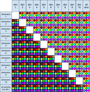
Take our GOV.UK feedback survey for example, you may have seen it appear in the header of the site from time to time, you may even have filled out the survey yourself. The current survey we run contains ten demographic questions and nine questions relating to user feedback.
Using a coloured dot for each of the nine graphable measures, and placing the ten dimensions in a grid below reveals that there are 999 different graphs plottable from this survey data! Of course half of these possibilities are analogous, but the remaining 504 combinations are enough to make finding trends a tedious task!
Pivot tables go some way to solving the problem of viewing so many combinations, though even these become time consuming, especially when you wish to view the data in any manner other than a table of figures. When this analysis is done on a monthly basis, the time spent can really mount up.
The Solution
Using data visualisation software (I use Tableau Desktop) I am able to load in the survey data and build an interactive workbook to explore the responses in detail. By creating a template I can select any dimensions and measures for a graph from a simple interface.
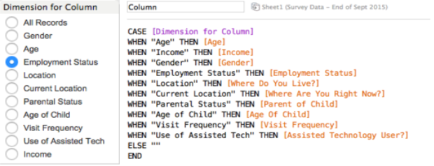
Such a template requires the use of parameters. Parameters are sets of allowed values that the user can choose from. In the case of this template, I want to be able to choose a dimension for my row data, a dimension for my column data and also a measure to graph them by.
Below to the left you can see the interactive list of allowed options in the ‘Dimension for Column’ parameter, on the right is a ‘calculated field’ I constructed, the field takes this choice and assigns the correct data to the ‘Column’ dimension.
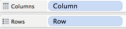
I then make an almost identical parameter and calculated field for the Row dimension, and another for the desired measure. The result is a visualisation that contains whatever I specify in the menu options.
Cohort considerations
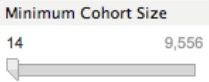
When quickly scanning through countless charts looking for trends, it can be easy to lose track of how big your sample size is. You may spot an interesting correlation, only to find that it is based on fewer than 20 responses. The way I deal with this is through the use of a filter.
A cohort is simply a grouping of records that share the same characteristics at a given time. In this case it could be full time workers between the ages of 25 and 44 who responded to the survey in the month of December.
Through use of the filter, I can set a minimum tolerance for the cohort size. If there are fewer responses in a cohort than this limit, then the figure is simply omitted. This is a great way to avoid coming to shaky conclusions, and also flag where further data may be required.
Spot trends with parameter driven conditional formatting
Where data is best presented in a table rather than a graph, it is advantageous to use conditional formatting to assist in analysing the data set. Compare the table below with the formatted table beneath it.
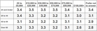
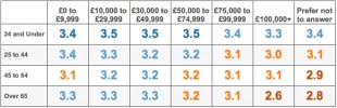
The inclusion of colour reveals a clear pattern in the data not immediately evident in the unformatted version, with the measure shown decreasing both with increasing age and with increasing income.
Of course conditional formatting is possible in pivot tables too, but using a parameter driven workbook rather than a pivot table presents a whole range of options in creating this formatting. By setting different colours based upon the Measures parameter, I can create custom scales based on which measure is being displayed. This means that each graph or table has the correct colouration the moment I select the dimensions and view it, rather than having to manually adjust after each change.
Taking the analysis further
As with pivot tables I can easily filter my data set by any of the dimensions or measures available. The difference is that with the workbook I am able to build smart filters that come into effect automatically for particular dimensions. This can be used to isolate anomalous or junk data (for example when looking at responses from under 21s, it would make sense to exclude those who put their employment status as ‘retired’).
Another benefit of avoiding static pivot tables is the ability to easily view trends over time with the simple addition of a date slider. This is far more convenient than manually updating dates, and can allow you to view a year of data in seconds.
Isn’t this a lot of work?
Making an interactive template such as this can take a bit of time, especially the first time around. However once you’ve learned how to build parameters and the associated calculated fields, it becomes a doddle to quickly put together a functional template for a given data set.
Of course using this method for simple data sets would be like using a Cray supercomputer to do your internet shopping, but where it really saves time is in situations where you need to do quick analysis of complex data, especially where you’ll be updating it again in the future.
Do you have any tips on how to visualise complicated data sets? How do you do it in your work? Please let me know in the comments!
Sean is a Senior Performance Analyst, working on GOV.UK. You can follow him on Twitter: @seanoptimised

1 comment
Comment by Jonathan posted on
Very interesting. I tend to use conditional formatting in a spreadsheet or Google Fusion - it isn't as flexible but is a free alternative to Tableau and has sliders etc. R Studio can be a pain to get set up but worth it for large data.