If you visit our services page today you'll see it has a new look.
We’ll continue to iterate on this page, as we’re doing elsewhere on the Performance Platform. But I thought it was worth outlining the changes we’ve made and the user research findings that underpin them.
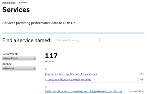
Yesterday the services page looked like this.

It was easy to find any particular dashboard - just scroll up and down a list, start typing a dashboard name or use the department and agency filters to drill down. The page was pretty basic though, and there was no insight into the performance of the services in the list or what data each was reporting.
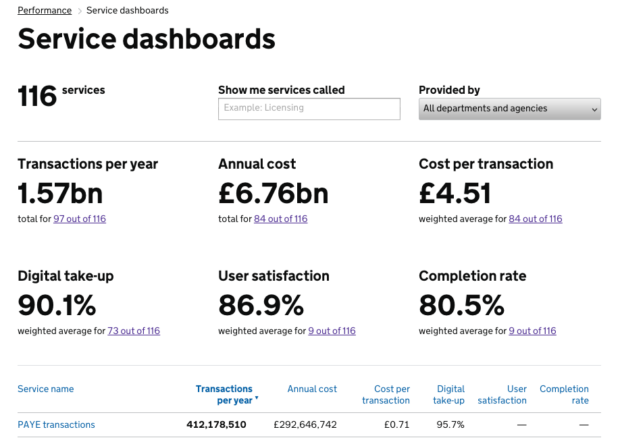
Our new page includes 6 key data points for each dashboard and overview statistics for those selected in the filter.

Our ambition with this page was to provide more information at a glance, plus department or agency views of transactional services. For example, if you filter by department the summary figures will update to give an overview of performance for that department.
What our users need
All of our users need to be able to quickly see the spread of data the platform provides and we think the new services page does a better job of that.
Service managers have said they want to see how their service is performing in relation to others in their organisation. Our new page will allow them to filter data by department or agency and see key numbers at a glance.
The Performance Platform has plenty of users who’re interested in the performance of government as a whole, for example civil servants responsible for digital transformation of services. Our new page helps them by providing a quick view of relevant data so they get a better idea of where to focus their attention. The summary figures at the top of the page give them an insight into how their department, agency or selected services are performing as a group.
The data we're showing
Our new Services page pulls data from all of the dashboards on the Performance Platform and you’ll probably spot that some of the periods of reporting are different. We’ve decided that it’s more important to show an overview of the latest data rather than make everything directly comparable. This means that users need to take care when coming to conclusions about relative performance, but we hope the page leads to further exploration of the data and the dashboards.
You may also notice that some of the figures shown are different to those on the Government Transactional Services dashboard. This is because we don’t yet have all the Transaction Explorer data on the Performance Platform. We’re working on this now and should be done by the end of February.
We hope you like the changes we have made and we will continue to iterate the page, in particular adding sorting to mobile and sticky headers. The sticky headers mean you will be clear about which column is which as you scroll down the page. I hope you like the changes we have made and please leave a comment with any suggestions
2 comments
Comment by Stephen posted on
So which of the 117 services on the old page got dropped off on the new page (116 services)?
Comment by Matt Harrington posted on
Hi Stephen,
Blood donation appointments was actually appearing in the list twice. Once on an old url and once on the new url (we added more modules to the dashboard) so we removed the one no longer in use. You'll notice that the number has dropped even more now. This is because we have consolidated some of the practical driving test dashboards to show more information on fewer dashboards.
Best
Matt