The Homelessness and Troubled Families Analysis Team at MHCLG have recently published the latest 2019 Rough Sleeping Snapshot statistics using a Reproducible Analytical Pipeline (RAP). This felt like a real achievement as we are one of the first teams in the civil service to apply this methodology across an entire statistical release (i.e. importing data into SQL > writing the release in R > publishing the release on GOV.UK). The Rough sleeping snapshot provides a way of estimating the number of people sleeping rough on a single night and can be used to assess changes in rough sleeping patterns over time. Implementing a RAP helped us to reduce the risk of introducing errors in the production of our release and meant that there was more time to focus on analysis, quality assurance, and explaining what the statistics were showing.
What’s in a name? …pain, if an ampersand does it contain!
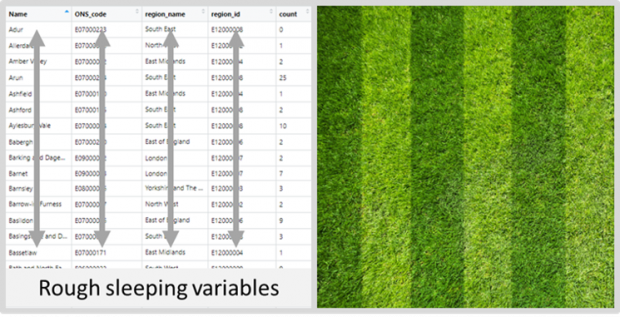
The first step was to import all ten years of rough sleeping data into our SQL database. Once all the data had been located it was imported into the database ensuring that each variable heading was identical and each variable assigned the correct data type (e.g. int, varchar) for all tables. To ensure that the naming convention of local authorities was standardised (e.g. 'Epsom & Ewell' was always named 'Epsom and Ewell'), an 'ONS name' table was imported into the database too. This table contained local authority names, ONS codes and geographical region variables. A left join of the 'rough sleeping' table with the 'ONS name' table (using ONS code as the unique identifier) ensured the names of local authorities across the ten years of data were all identical, so that aggregating data by local authority name would correctly count all the observations for each. Once we were happy with the quality of the data we then produced the live tables in R via the openxlsx package without having to leave R or even open Excel.
Abide by coding commands and the Gods will grant your data demands.
The next step was to link RStudio (specifically an RMarkdown document) to the rough sleeping SQL database to interrogate the data and write the report. Writing R code that cut through the data to produce easily understood outputs was a very satisfying exercise. A bit like arranging shapes in Tetris or mowing a lawn into straight parallel lines. The latter example is in fact not an entirely foreign concept to the way we organised our data. Not to say we all have green fingers but we did spend a lot of time wrangling data into neat columns. This approach of data management is popularly referred to today as 'tidy data'.
Whatever one’s gardening preference, ensuring that our data was in a tidy format made it easier for us to interrogate it in a consistent fashion. This was when the analysis became interesting, as we were now able to generate useful visualisations from the rough sleeping data (e.g. choropleths, line plots, scatter plots), that could be used to show patterns and identify trends in rough sleeping numbers. What’s more, once we had written the RMarkdown code it could be easily re-run should any local authority rough sleeping numbers need updating. We had now created the beginnings of a RAP and avoided having to repeat manual manipulations of data in spreadsheets.
Alas, the coding Gods are fickle, misplace a hash and your output will crash.
There were times however when coding was exasperating, but I have come to learn over the years that this is all part of the script building process and is commonplace when coding. During the course of RAP development I recall spending more time than I’d like to admit trying to identify why a plot I had run several times before, all of a sudden would not run on a new set of data I was interrogating. It later transpired that I had used a pipe operator (%>%) where I should have used a plus symbol (+). Frustrating! However, I recently discovered that this was one of Hadley Wickham’s regrets when he designed the ggplot2 package and is an error he himself admits to making. It was/is good to know that even RStudio data scientists fall in to similar traps when coding.

To see or not to see
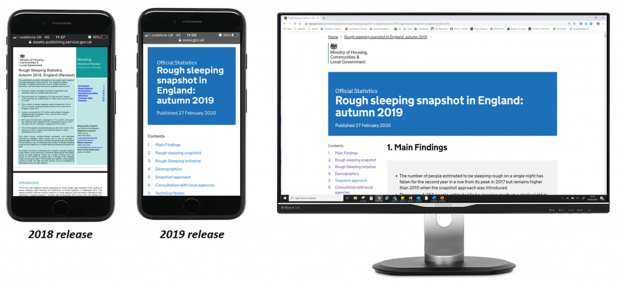
An important aspect of implementing a RAP is to generate an output that improves user engagement with our statistics. Traditionally, the rough sleeping statistics were drafted in a word processor, converted to a pdf and uploaded to GOV.UK. Now, the rough sleeping snapshot is published as a HTML file and the benefits are manifold.
Reading a pdf version of the 2018 rough sleeping statistics would not have been a user friendly experience, and even unreadable on some devices. Whereas the html version of the 2019 rough sleeping snapshot has been designed to be displayed in a web browser and consequently offers a drastically improved user experience.
That’s a RAP
Moving towards a more automated approach when publishing the rough sleeping statistics, by implementing a RAP, has improved the transparency of our analysis and reduced the risk of introducing manual errors into the report. One difficulty worth mentioning though was the inability to share the report directly from the GOV.UK Whitehall website to people authorised for pre-release access. To share the report we had to generate a separate version of it using the govdown package. This felt like duplicating our work, particularly as the report was already uploaded to GOV.UK Whitehall.
Finally, we hope that our release will be shared as a showcase example for other departments wishing to implement a RAP on their own statistics, and that other data scientists across the civil service take up this challenge and enjoy it as much as we did. Thank you to the Homelessness and Troubled Families Analysis Team and colleagues from The Best Practice and Impact division for all their support, in particular, for writing the invaluable govspeakr package. Now, I’m afraid you’ll have to excuse me, I have a lawn that needs attending.