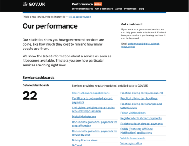
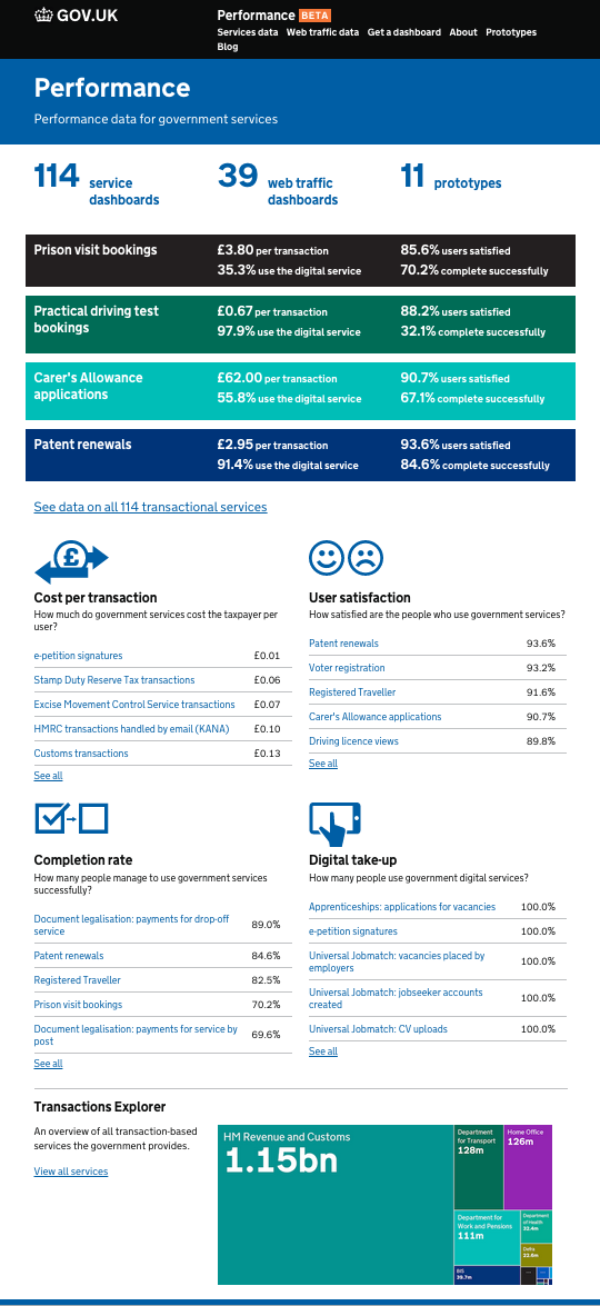
Yesterday we updated the Performance homepage and you can see the changes below. I wanted to share the research that’s behind them.


Last Autumn we asked members of the public what they thought of our homepage. They’re not our primary users, but we’d like our service to be understood by everyone.
We wanted to see whether people could describe our service just by looking at the homepage. We found that new users had problems with this. Several found it confusing:
What are dashboards? I have no idea what dashboards are. Aren't they something in a car?
In some cases our homepage was completely misleading, with some thinking it was a glossary of government services where you could perform an action:
Here I can apply for a passport, pay for tax, claim State Pension – these are things I'd expect a website to do – quite clear so far.
We also decided to take a new homepage mockup out onto the streets of London. We walked around Holborn and showed it to a dozen people, asking them what the site was and what they could do with it. We made more refinements based on what people told us.
The result of this work is the Performance homepage you can see today.
We’ll revisit this work as more departments, services and data sources join the platform. But for now we’re confident that people outside of government can understand what platform is and what they can do with it.
3 comments
Comment by Nathan W posted on
Check the layout of the page on a cellphone — the icons above the headings are slightly misaligned 🙂
Comment by Andrew Robertson posted on
Could you share any insight into why you added the images (like the pound with arrows)? I note that GOV.UK used to have icons in the early days to represent different content types, but were removed as users didn't understand them. The current GOV.UK content guidelines suggest we don't add images or logos unless it helps people complete their task. I'm not against icons: just interested in the thinking.
Comment by Henry Hadlow posted on
Hi Andrew
You're right – it's not often a good idea to replace text with icons, because icons are less clear and have to be learnt. However GDS do use icons and simple illustrations from time to time and they're definitely not banned https://designpatterns.hackpad.com/Iconography-UoIkbsbqgll
The user need for the homepage is to explain what http://www.gov.uk/performance is. As it's a fairly niche product, I added the icons to try and make it a bit more visually engaging!
Henry