At the Performance Platform we have completed a round of Product Audits with our users. Des Traynor at Intercom (who we got the idea from) describes them as
A simple way to visualise this is to plot out all your features on two axes: how many people use a feature, and how often.
Matt wrote about our first one here.
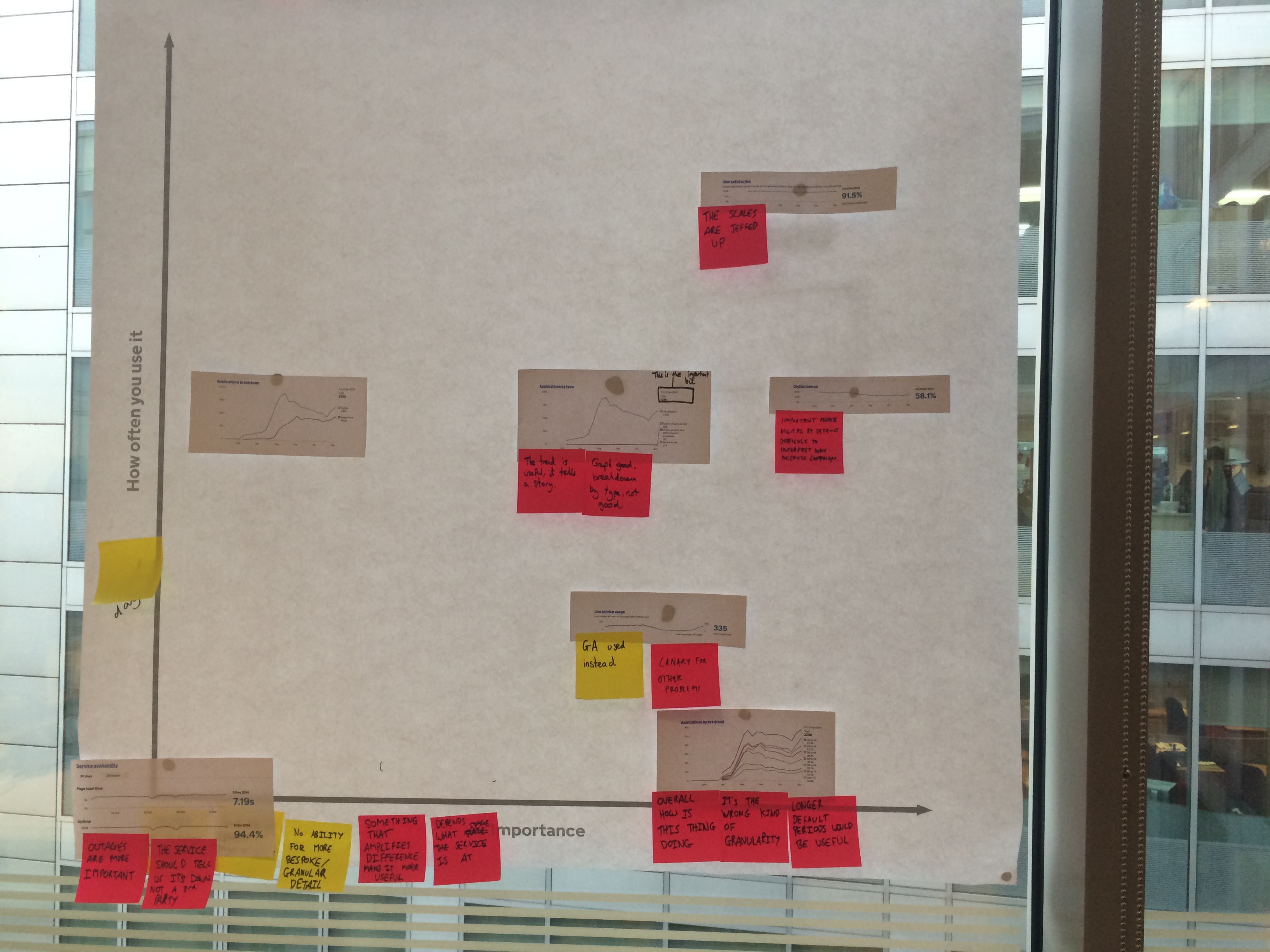
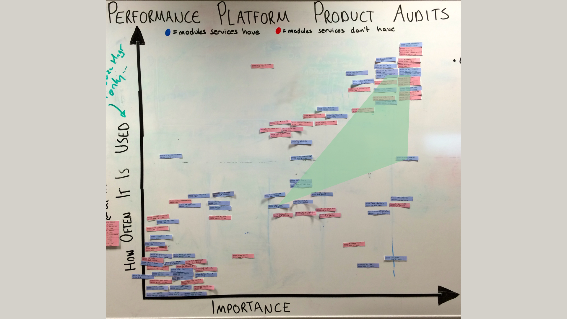
For the audits we printed off all the modules the service had and asked the team to map them on an axis of importance versus frequency used. As they were doing this we asked them to explain their thinking. Here is a picture of the one we did with the Register to Vote team.
We've completed eight audits with seven different teams, responsible for the digital transformation of the following services.
- Prison Visits Booking
- Lasting Power of Attorney
- Booking a Practical Driving Test
- View Driving License
- Renew Tax Disc
- Register to Vote
- Carer's Allowance Applications
- Patent Renewals
We also asked participants to map modules that we have but they aren’t currently using.
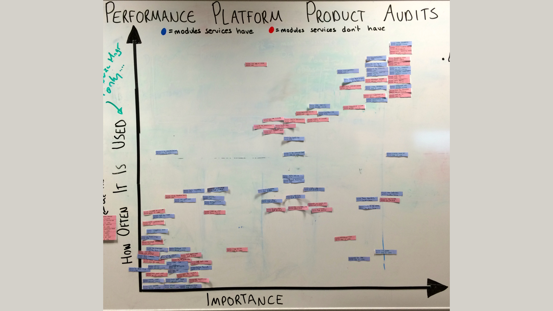
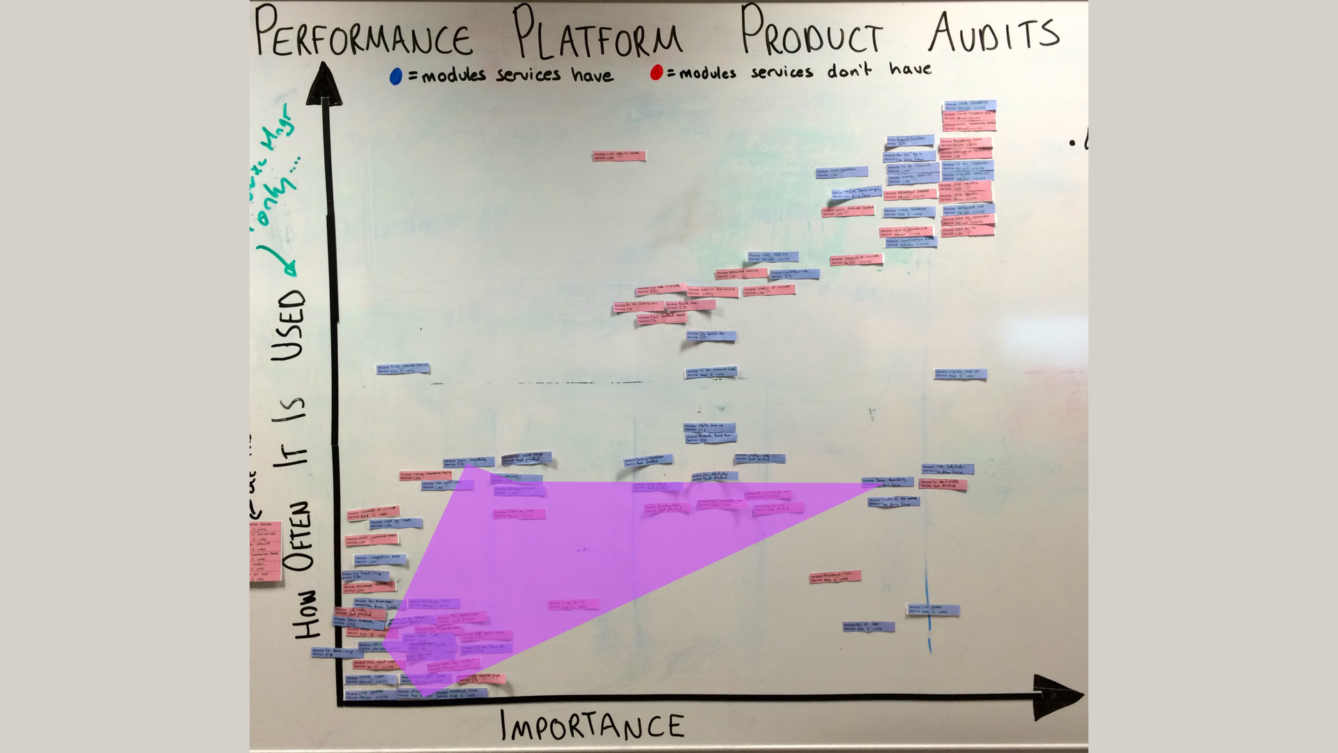
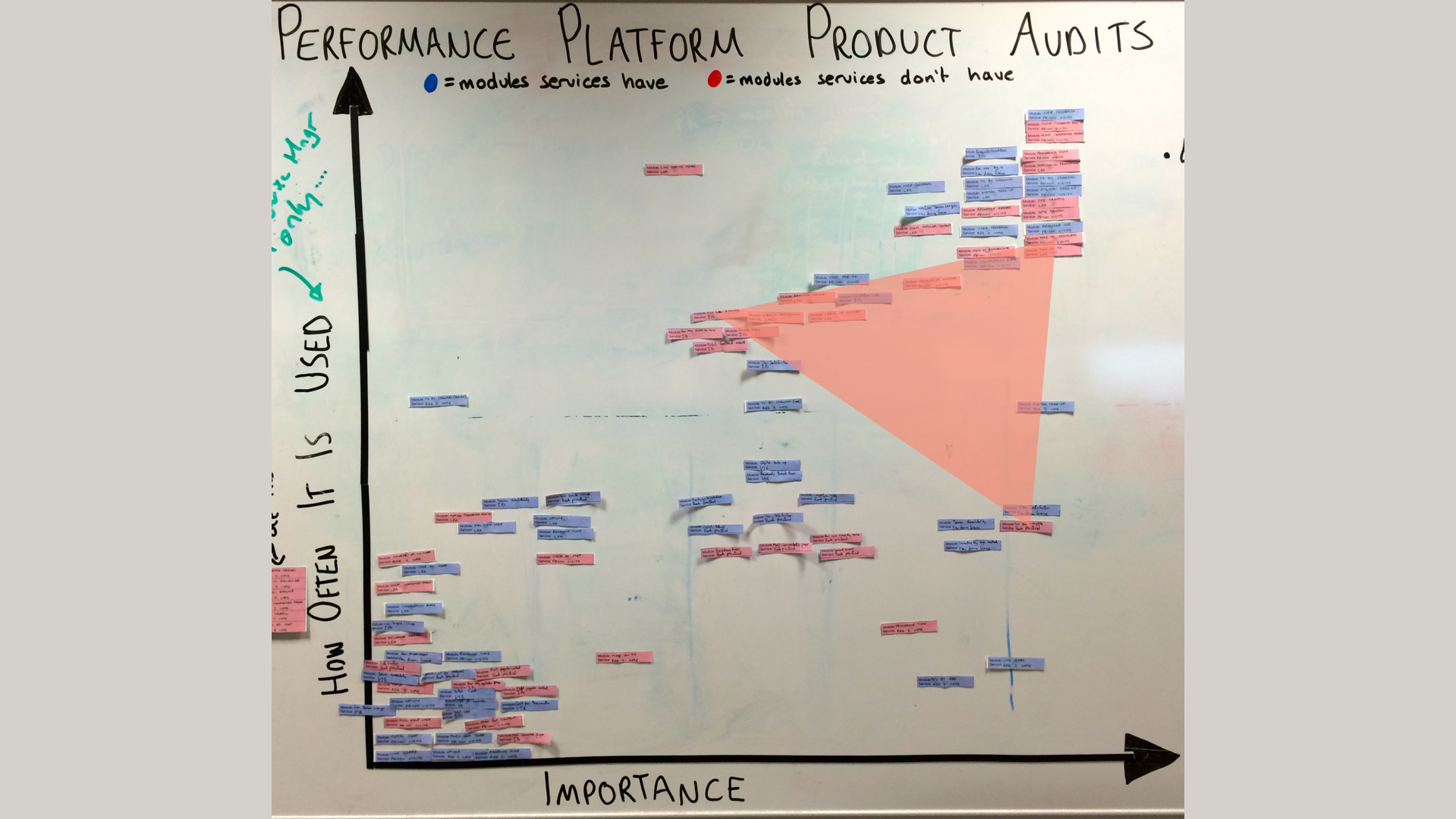
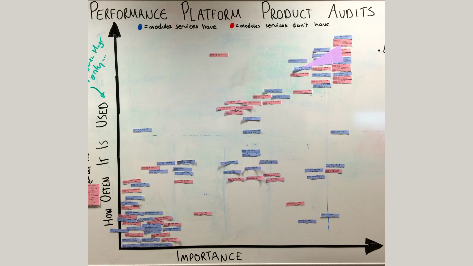
Matt, our Product Owner, and I were present at all the audits and we tried to ensure at least one other team member was there as well. Once we completed each audit we mapped its findings onto a large white-board next to where our team sits. Blue labels represent modules people have, red show ones people don't have.
We also wrote up our interview notes and put them into a shared folder so that those who weren't present at the audit could see what was said.
As you can see the board got pretty cluttered, but it was useful to see where our 4 KPIs fared and if there were patterns with other modules.
I used Keynote presentation software to create the following visualisations. Firstly, the KPIs:
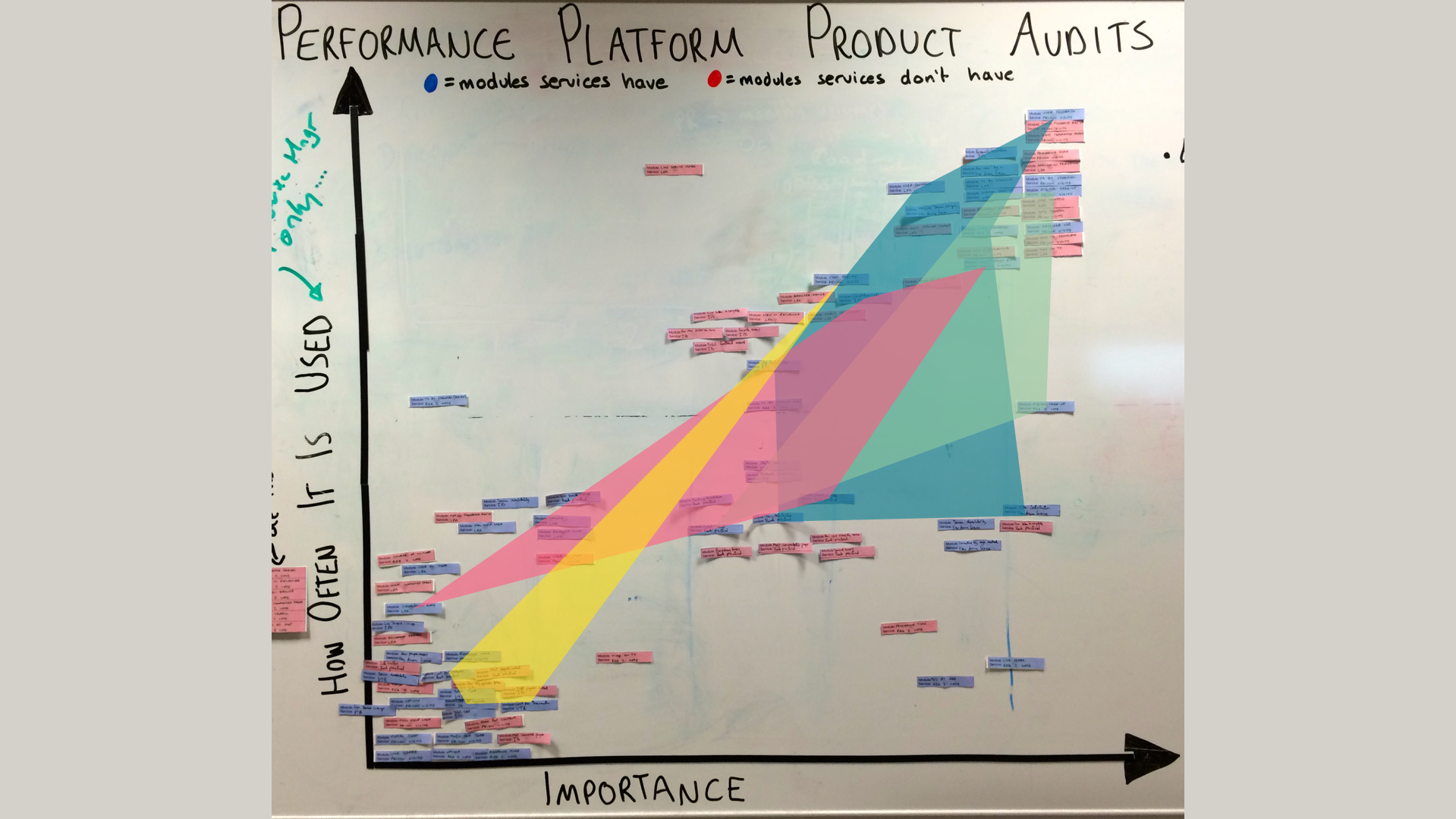
User satisfaction and Digital Take Up were the two highest ranked modules. Our users said they put these there because this data isn't available in other analytics tools. It’s also a good litmus test for seeing if your software releases are having their intended impact.

Completion Rate scored well except in one case, Lasting Power of Attorney applications. This is because there are two types of completion - we’re trying to solve this as Matt has written here.

Cost Per Transaction didn't score highly as it only updates every quarter. Also it’s influenced by many factors, some outside the remit of the digital teams we spoke with.


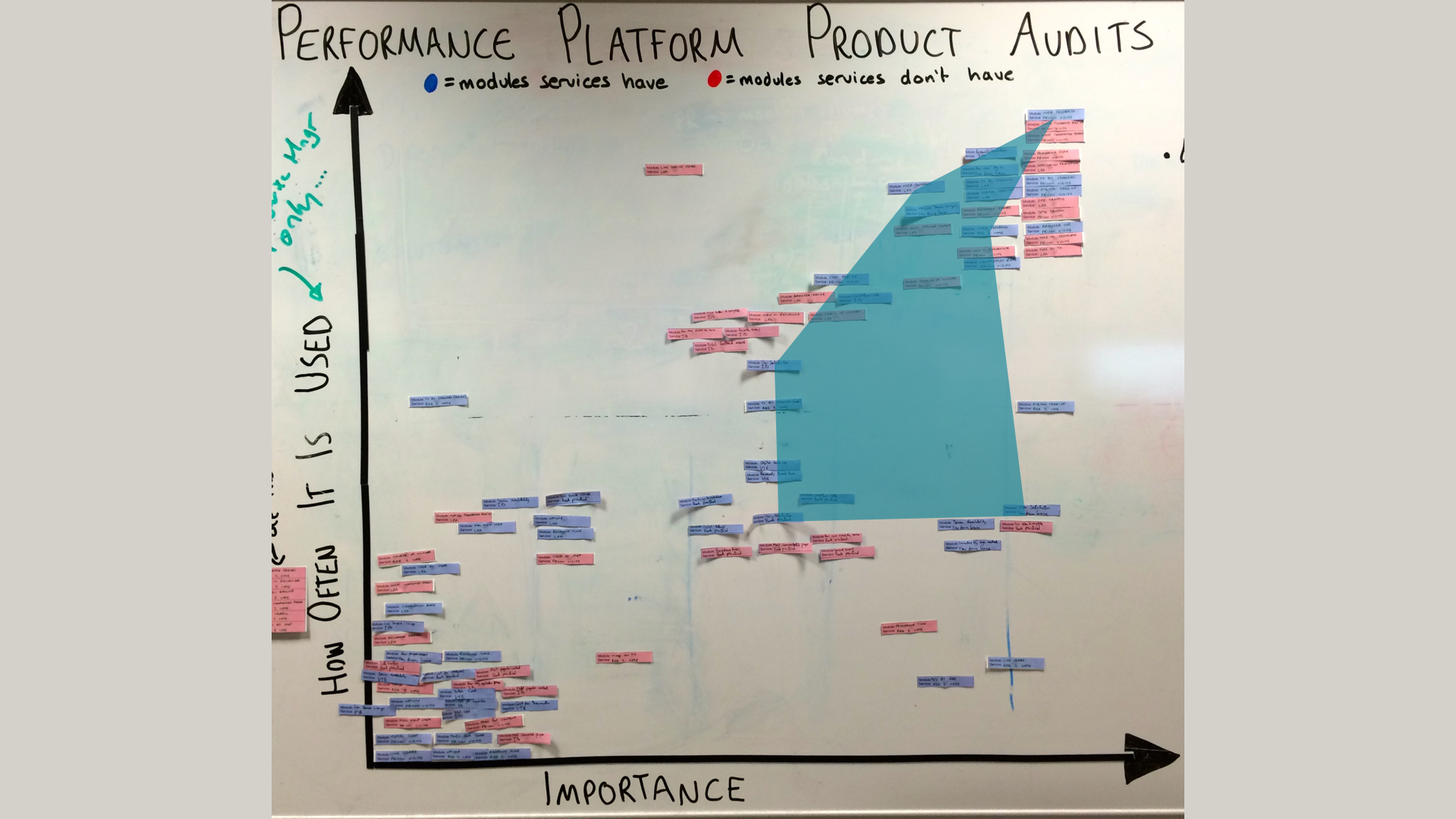
As the Performance Platform offers many more modules than just the 4 KPIs, we wanted to see if there were patterns elsewhere. Two that didn’t fare as well are ‘Uptime’ and ‘Page Load Time’.
If a module is consistently placed in the bottom left we found that there’s either:
- No user need for it. Do we remove it, as it is a distraction?
- there’s a user need for it, but it’s not done well enough or contains errors. Do we prioritise working on it to improve it?
Another really interesting discovery we made was the desire to find out how long things take to do. These two pictures show where service teams put ‘Time on transaction’ (how long it takes a person to complete the online part of a service
Processing time - how long it takes for an application to be completed

This is compelling because one of the biggest user needs for government services is 'how quickly can i get my thing'. This can be benefits, a registration, an application etc. We already show ‘Time on Transaction’ for Application for Carer's Allowance and it's something we’d like to start rolling out for more services. Later we could add processing times, and ultimately we could combine both metrics to show how long the process takes from a problem state to a resolution state. For example
My father died, he was looking after my mum. I need to look after her now, I need some money to do this.
Resolution state
I have money in my bank account from a Carer's Allowance.
Once we know these timings we can help service teams work to reduce them to meet these needs.
Product audits have been really beneficial for us to identify why and how our users are (or are not) using the things we are building. It's also a massive help in prioritising future development work.
You can download a PDF of my playback here.