Usually at our Data Science Show and Tell events there are presentations on successful projects. This time we decided to turn that idea around and look at ‘celebrating our failures’.
Why? Because in our day to day data science work failure is always a possibility; it’s how we learn and avoid more serious failures in the future. The term ‘failure’ can refer to a range of circumstances from a simple code issue, like the misplacement of a bracket, to a fundamental misunderstanding of the problem you are trying to tackle. Here are some examples of what we learnt at the show and tell session.
Predicting hospital demand using meteorological forecasts
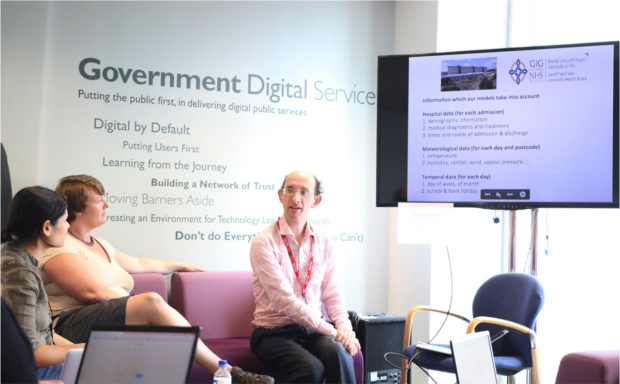
John Minty from the Department for Work and Pensions (DWP) talked about a project from a previous job that tried to use weather data to predict hospital demand. John learnt the value of asking for the right data; at the Met Office, a longer-term ‘climate’ forecast and a short-term ‘weather’ forecast provided similar data, but meant very different things! John also found that the work did not give the high impact insight that was hoped for as the hospital planners wanted very detailed demand forecast models, but only a broad one was statistically robust.
Economic Growth dashboard: the limitations of DC.js
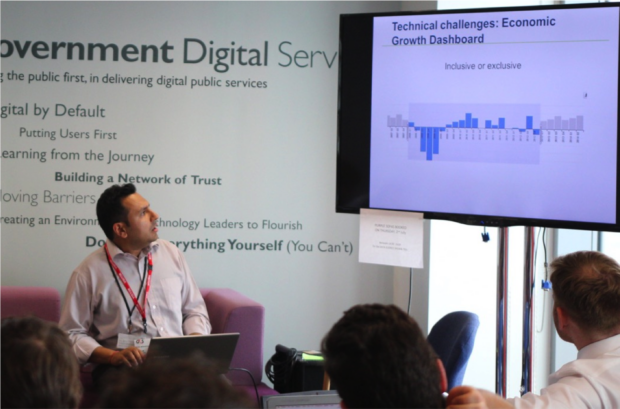
Hiren Bhimjiyani from the Department for Business Innovation and Skills (BIS) talked about his experiences developing a economic growth dashboard with the D3 JavaScript library and the extensions Crossfilter and DC.js. One of his learning points was not to assume that one JavaScript library will solve everything. After finding limitations with the DC.js functionality, he will look to use more advanced D3 to meet the user need in the long term.
Commas can hurt you - heed your R data import warnings!
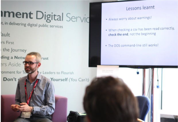
Dave Bonfield from BIS (and recently on our Data Science Accelerator programme) explored the issue of ignoring warnings during a data import. Often, the first few rows of your imported data may look correct, but a stray comma later in the CSV file can ruin the rest of your dataset. His advice to avoid this problem was simple, but important: listen to warnings and check the end of your data not the start. We usually check the ‘head’ of a dataset on import, but rarely the ‘tail’ - which in the case of a CSV file can create all sorts of problems further on!
Fighting the 2D user experience for data discovery
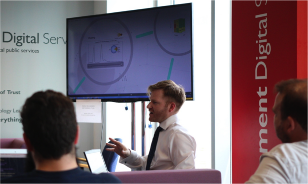
Adam Beirne from the Ministry of Defence (MOD) gave an insight into his work on developing data discovery tools. Adam’s challenge was to introduce more multi-dimensional visualisations for his users to explore data patterns. He showed some examples of cutting-edge work around the world to create a multidimensional data discovery experience from 3D printing to virtual reality goggles. After some experimentation and user feedback Adam decided that with the current user infrastructure limitations his data visualisations will have to stay in 2D for now.
Enhance your calm with Twitter API rate limits
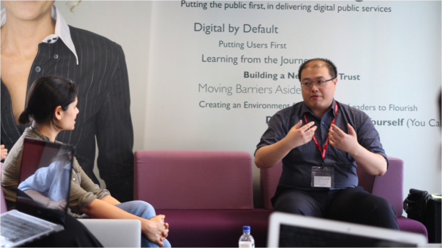
Weichao Wang from DWP shared his experience of gathering data from Twitter using the Tweepy Python package. He faced a commonly encountered problem with the Twitter API of rate limiting data downloads. He realised that although his code was properly limiting the call rate, he had not fully stopped previous API calls. These created a compound effect and resulted in multiple 420 errors.
We’d like to thank our presenters for sharing their experiences. It takes confidence and nerve to stand up in front of your peers and talk about something that didn’t go as planned.
If you are interested in coming along to the next Show & Tell on August 27th 2015, please let us know by writing in the comments below or contacting us.
3 comments
Comment by Derek Armstrong posted on
GDS is doing some really cool work. What strikes me as the true innovation is your mindset: openness about how to approach problems, keeping language simple, and providing the tools that enable others start their own projects.
At the Treasury Board Secretariat here in Ottawa, we've been having a lot of success with the types of dashboards and JavaScript visualizations that you use, but we are a pioneers on the frontier of data science in our world. We're still overcoming the IT support trust barriers that keep us from really bringing together our business and data/info management expertise.
We'll keep following your very interesting posts!
Derek Armstrong
Director, Expenditure Analysis
Government of Canada
Comment by Derek Armstrong posted on
PS - Here's an example of the visualization work we're doing on government financials and people management data. TBS InfoBase: http://www.tbs-sct.gc.ca/ems-sgd/edb-bdd/index-eng.html
Comment by Dan Heron posted on
Hi Derek, Thanks for your comments and for making us aware of the TBS InfoBase - it looks very interesting! Great to hear that TBS Canada is working on data science - my colleagues have been previously in contact with your Open Government team. If you have some data science examples you'd like to share then please get in touch with us: gds-data-science@digital.cabinet-office.gov.uk