Digital analytics and other data sets tell us what is happening, and user research helps us understand why. So, working together, our two disciplines can provide richer insight for our colleagues in multidisciplinary teams.
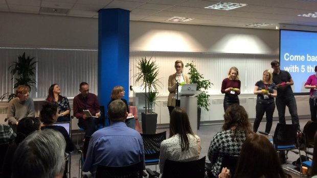
In October, between 70 and 80 members of the cross-government user research and performance analysis communities got together at HMRC’s Digital Data Academy in Shipley to explore working together more effectively and to share what they’re working on.
Understanding our surveys and how people complete them
Alison Hawkesworth, a user researcher at the Office of National Statistics (ONS) kicked us off with a presentation on ‘understanding our surveys and how people complete them’. Alison described how, as survey forms are moved online, ONS now has access to a rich set of data about where users are struggling with the questions. Digital analytics was implemented on the UK Innovation Survey form to track:
- dwell time
- total pageviews
- errors
- timeouts
- exits
- use of save and complete later
- use of show/hide guidance
- use of print screen
This has allowed Alison to identify ‘painful questions’ and unhelpful error messages as well as opportunities to improve guidance.
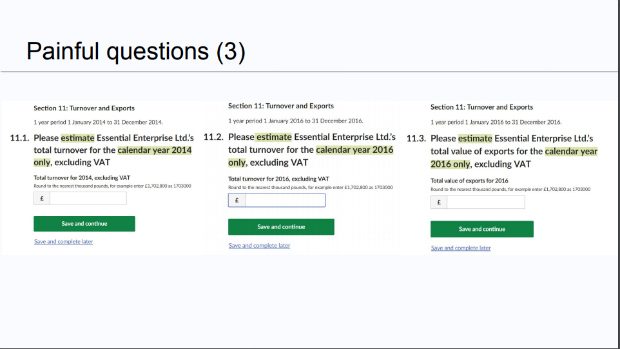
As a result, this survey has been redesigned and will be tested at its next outing. Meanwhile, Alison and colleagues have a backlog of work on other surveys covering prototyping, content review, research, design and development.
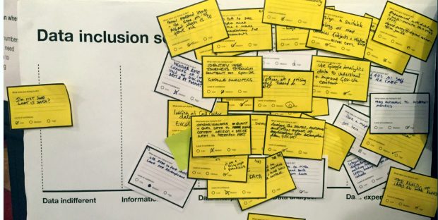
Digital inclusion isn’t enough when dealing with data
Louise Petre, a user researcher at data.gov.uk, reviewed her recent research. Successfully finding and evaluating data isn’t only about digital skills. Some users may have strong digital skills but weaker confidence with data. Users’ levels of data skills influences their user needs when they search for data and evaluate how useful it is.
So, the team developed a data inclusion scale, that can categorise users as:
- data-indifferent
- information seeker
- data interpreter
- data analyser
- data expert
Data.gov.uk will continue to test and iterate by collaborating with people both in and outside of government.
Lorna Tang, Data Advocate, then presented on a practical example of making data more accessible to non-analysts in the large GOV.UK team. After speaking to content designers, researchers and data experts, she created 8 data resource cards.
The cards aim to:
- make people aware data exists
- show them when and how to access the data
- indicate the most appropriate use and the value of combining data sources
HMRC Digital Data Academy
Our host, Richard Moss, Head of HMRC Digital Data Academy, described his team’s work in setting up a centre of expertise in collecting, interpreting and sharing digital data across the organisation.
He shared the Academy’s approach to recruitment and making the Civil Service an attractive destination for graduates leaving academia.
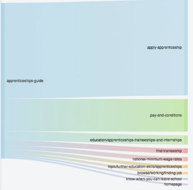
Using BigQuery to visualise user journeys
Stephen Bell, Digital Analytics Platform Manager at GDS, demonstrated different ways to create Sankey diagrams.
These are valuable to both analysts and user researchers, as ways to visualise how people move through a website. They are also very flexible, as they can show bounce rates and time on page, as well as how many people go from one page to the next.
The first topic was traffic flows. This kind of chart shows the total volume of users moving between two pages, and it can show if most people are following the journey we would expect them to follow.
Here’s an example of this diagram, which shows where people go from the ‘Apprenticeship guide’ page on GOV.UK:
The second topic was user flows. This is where we track the exact journeys anonymised users make, and see which journeys are most common. Using another BigQuery query, he created the data below, which shows the most common journeys on GOV.UK and the amount of users who followed that journey:
- /vehicle-tax-refund>>/sold-bought-vehicle>>/sold-bought-vehicle/y>>/sold-bought-vehicle/y/no>>/sold-bought-vehicle/y/no/sold-it>>/sold-bought-vehicle/y/no/sold-it/sold-it-privately-to-a-person-or-business – 6336
- /vehicle-tax-refund>>/sold-bought-vehicle>>/sold-bought-vehicle/y>>/sold-bought-vehicle/y/no>>/sold-bought-vehicle/y/no/sold-it>>/sold-bought-vehicle/y/no/sold-it/sold-it-to-a-motor-trader – 5028
- /government/organisations/companies-house>>/get-information-about-a-company>>/government/organisations/companies-house>>/get-information-about-a-company>>/government/organisations/companies-house>>/get-information-about-a-company – 2826
Again, this data can be turned into a flow chart, as it can effectively communicate how users most commonly move through the site.
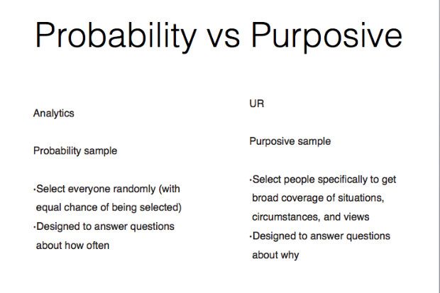
Reconciling user research and analytics evidence
Mike Suter-Tibble, Head of Digital Performance Analytics at DWP, discussed the situations where evidence from user research and evidence from analytics appear to conflict. Does this mean one of them is wrong?
He suggested that often the reconciliation lies in understanding the different approaches to sampling.
In analytics we use a probability sample, which involves, selecting everyone randomly (with an equal chance of being selected). This type of sample is designed to answer questions about ‘how often’.
In user research, on the other hand, we use a purposive sample, which involves selecting people specifically to get broad coverage of situations, circumstances, and views. This type of sample is designed to answer questions about ‘why’.
With this in mind, we can use more precise language to describe findings. For example:
People from all/a wide range of backgrounds/capabilities struggled with this.
Analytics either supports this, or suggests there’s another characteristic driving it that we’ve not captured.
Retrospective
We wrapped up with a retrospective. We asked small groups of both performance analysts and user researchers to explore what they liked, learned and longed for about working together in the last year.
We agreed it's good to work together as we can build a much richer picture of user needs and behaviour, but it would be good to have more time to spend together thinking about what the problems are.
We also agreed that there’s sometimes the expectation from others that we'll come and provide all the answers, whereas actually facilitating what questions we ask is equally important.
Finally, we get together again next year; but in the meantime, the two communities will be meeting separately in December.
Peter Jordan is Head of Performance and Data Analysis at GDS
2 comments
Comment by Aoife posted on
Hi,
I'm a researcher working in the Apprenticeships service and I'd love to get more context around the Sankey diagram shown above if possible!
Comment by Peter Jordan posted on
Aoife. I'll get my colleague, Stephen Bell, to contact you.