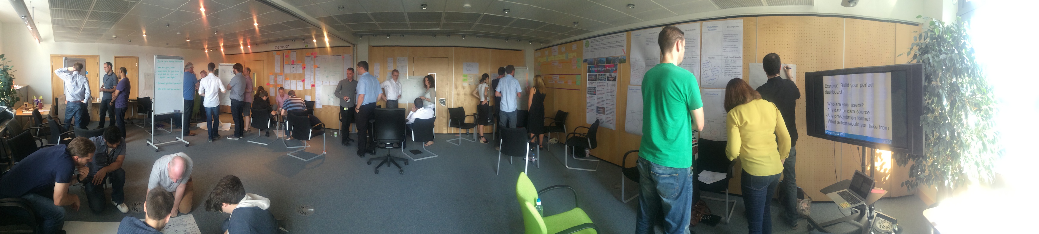
At the Performance Platform we regularly run workshops with service managers to get more understanding of their needs. This time we asked them to design their own dream analytics dashboards.
While the dashboards sketched by service managers aren’t likely to win any design awards or anything, they give us a clear idea of the kind of developments we can add to dashboards in the future. This will make dashboards even more useful to users than they are now.
We asked the managers to think about the data they currently have access to, and then set them the task of designing their own dashboard with this in mind.
We don’t want to limit the possibilities of what dashboards can bring users, so we asked the service managers to design dream dashboards that:
- include any type of data or data source that relates to how the service performs - including online and offline sources, qualitative or quantitative data
- can be presented to users in any communications format, eg email, or via SMS if it’s useful.
- use any type of visual to help service managers improve their service for users, eg maps, graphs or tables
Here are some of the outcomes.

On the very first sketch you can see how the service manager has broken down the whole service into individual transactions and then placed some key performance indicator (KPI) data within each step, eg user satisfaction, cost per transaction. This is a way of measuring services that we hadn’t really considered before.
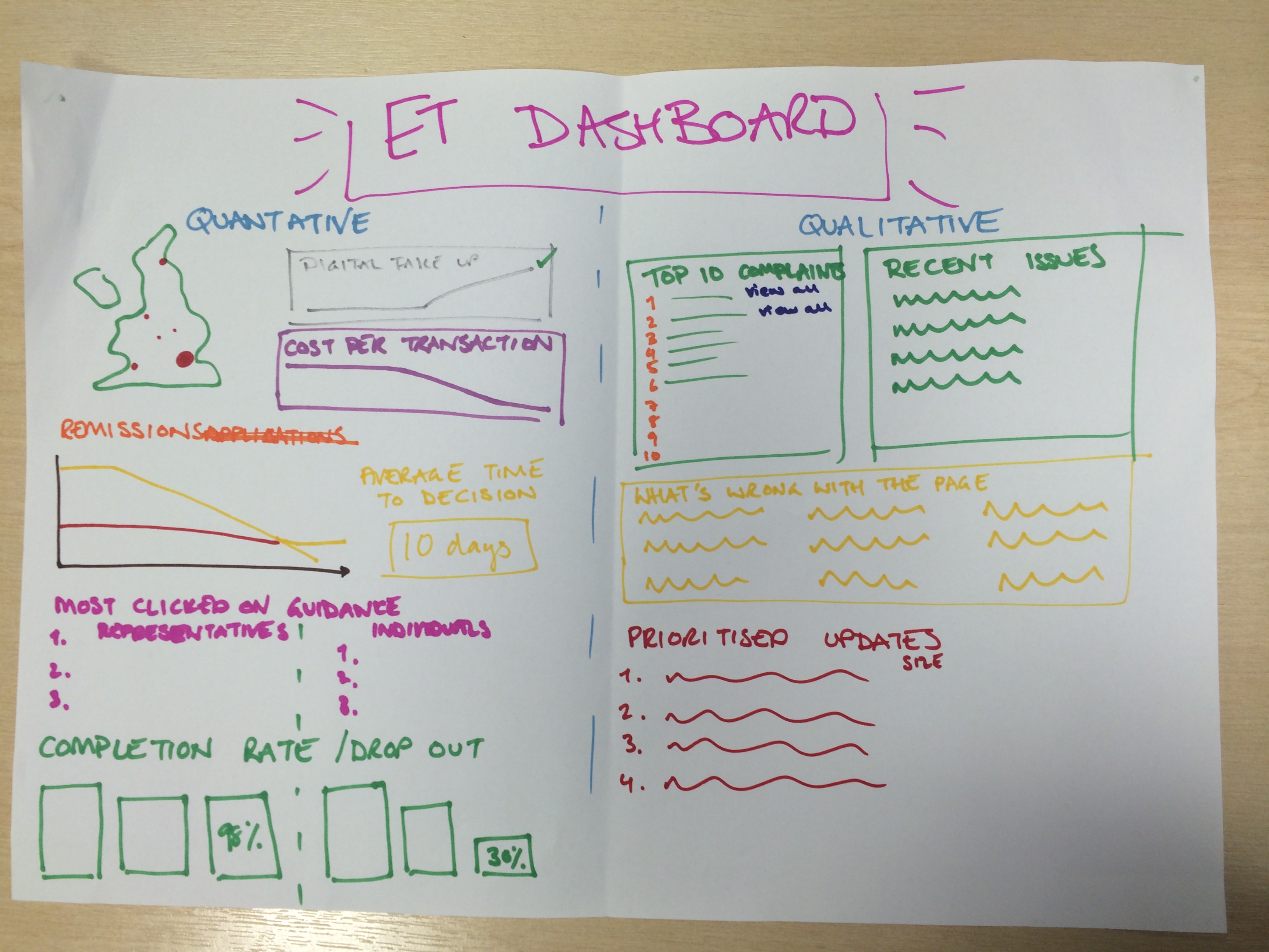
This sketch suggests that we split the dashboard into quantitative and qualitative data. At the moment we only capture quantitative data, but on more than one occasion, we’ve had service managers asking us for qualitative data, eg recent issues users had with their service. Since this feature is obviously a service manager need, qualitative data is definitely something we want to explore.
The second workshop we run with our users is based on getting them to break-down a standard dashboard. We ask them to identify data they find useful and the sort of data they’d like to see that’s missing. Here is an example of a generic dashboard used.
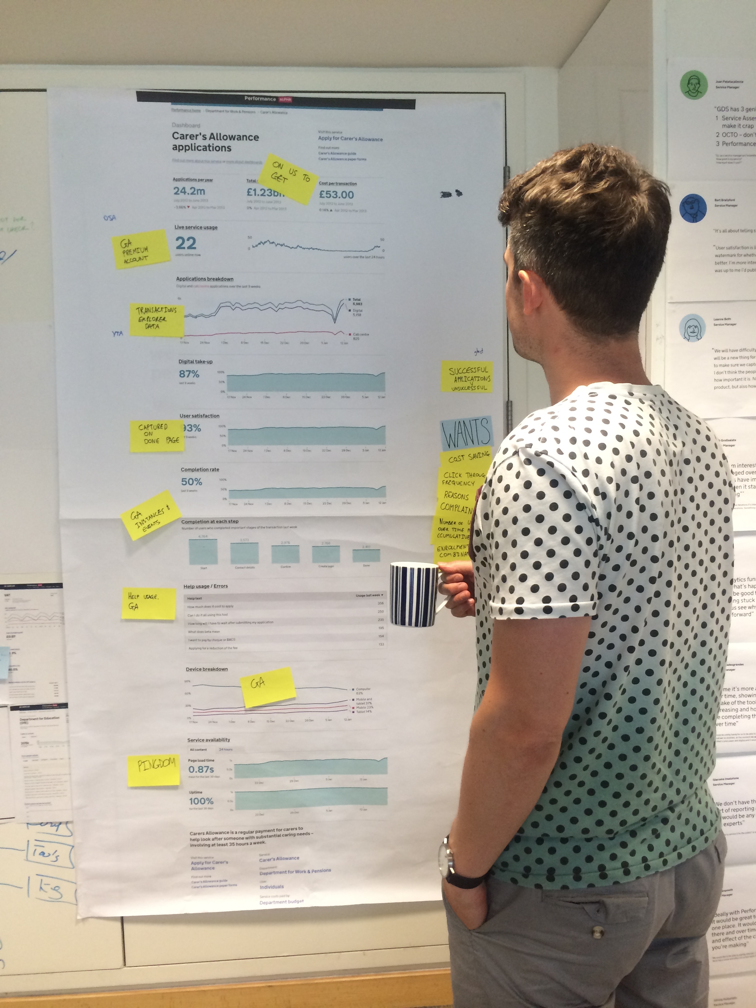
We find these workshops useful as it gets participants thinking about data in an active and engaging way, and gives us more insight into our users’ needs.