I recently wrote about iterating the way we share data when the user needs of the teams we work with change.
A quick recap. As digital performance analysts we’ve got lots of ways of sharing data: daily reports, weekly reports of charts, a weekly face-to-face meeting and a dashboard. The dashboard is the most visible of these, it’s on a large screen so that all of the team (and anyone walking past) can see it.
In this post I’m going to tell you more about the dashboard, and how we decided:
- what to include
- where to host it
- how to display the information
What to include
Sarah and I, the performance analysts, met the scrum team and talked about the old version of the dashboard. Real time information was useful for the first few weeks. But the team was no longer interested in which page someone is on in real time. Also, our service has very low volumes, so usually the number on the site right now is zero.
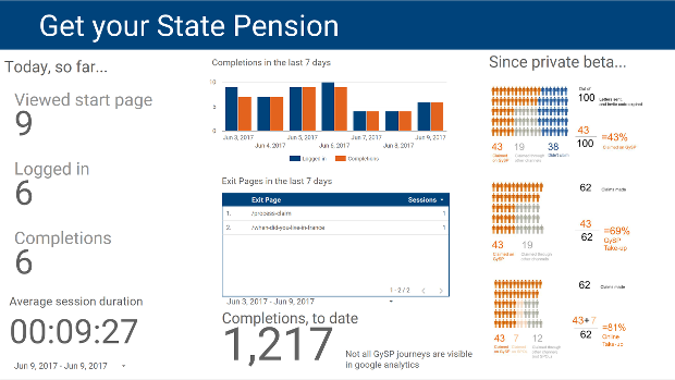
The team were still interested in how today is going, and to be able to compare with previous days. But too much context can be unhelpful – you can’t see the wood for the trees. Instead of a time series going back to the start, we’ve restricted it to the last 7 days. The real-time data has been replaced with the most important metrics that update every 5 minutes.
We also decided to add a new infographic to measure ‘take up’ (the proportion of people who claim by using the Get your State Pension service, out of all people who make a claim). We’re keen to improve take-up compared to the other ways you can claim your State Pension.
Where to host it
Usually we’d use the inbuilt Google Analytics Dashboard function to share and display Google Analytics – sounds obvious, doesn’t it? But the decision to move away from the real-time information meant we weren’t tied to it any more.
In fact, we weren’t able to use it because we wanted to include the take-up metric, which is data that’s not captured by Google Analytics.
We’ve decided to go with another Google Product, Data Studio. It’s specifically designed for sharing information in this format. You can refresh the data as often as you want so we’re taking advantage of that.
How to display the information
Here’s where my Data Presentation Champion stuff comes in. What I’ve learned about charts, words, colours and layout has been really relevant.
I previously led a multi-disciplinary team in designing a new template for publication of DWP statistics on GOV.UK. The team was made up of data visualisation experts, a content designer, a brand manager and members of the GOV.UK publishing team.
We researched good examples from other departments and beyond government. We considered the writing style. We thought about who our readers might be and how much they knew about benefits. We looked at colour schemes and accessibility for screen readers. We wanted to front-load the most important information on the front page, like a newspaper. And of course, we wanted to tell a story that makes sense and is interesting.
DWP were nominated for the Government Statistical Service Presentation and Dissemination prize for the work, and for getting lots of statistics producers to use the template.
I decided to use the same approach with our internal presentation of stats and showed Sarah, an analyst on my team, the template.

Sarah made the following choices when designing the dashboard:
- words - we use simple descriptions and don’t assume too much knowledge about Get your State Pension
- layout - columns of information, because on a screen we tend to read down the left-hand side first, then across
- charts - just enough history to give today’s data some context (a bar chart helps emphasise the differences between the two series on each day)
- a table for information that wouldn’t work well in a chart
- colour scheme - less important information is in a lighter grey, so that the numbers pop out (we chose blue and orange as these are safest for colour-blindness)
We’ve had brilliant feedback from the team about the new format. They find they’re talking to visitors about it more now because people are asking questions or making comments. I’ve even had comments and enquiries from colleagues in other offices who want one for their own project. A great form of feedback!
We’ll look at the dashboard again in the coming months to check it’s still meeting our users’ needs. If it’s not, we’ll improve it again.
Catherine Hope is a statistician and leads the team of Digital Performance Analysts working in Newcastle. She is also DWP's Data Presentation Champion.
2 comments
Comment by David Williamson posted on
Hi Kate
Really like your Data Studio dashboad.
Is it possible to share some more technical detail on how you built it?
I've got similiar publishing needs where I work and interested in knowing how you got your take up data into the dashboard
Dave
Comment by Catherine Hope posted on
Hi Dave, at the moment they are uploaded as static pictures because the rates only change once per month (and they don't change much).
It's not very elegant: we create them in Powerpoint, copy the slide, paste it into Paint and save it as a png file. Then upload to Data Studio.
I've used a link to a Google Sheet before too, this might be a way for you to do something similar.
I hope that helps.