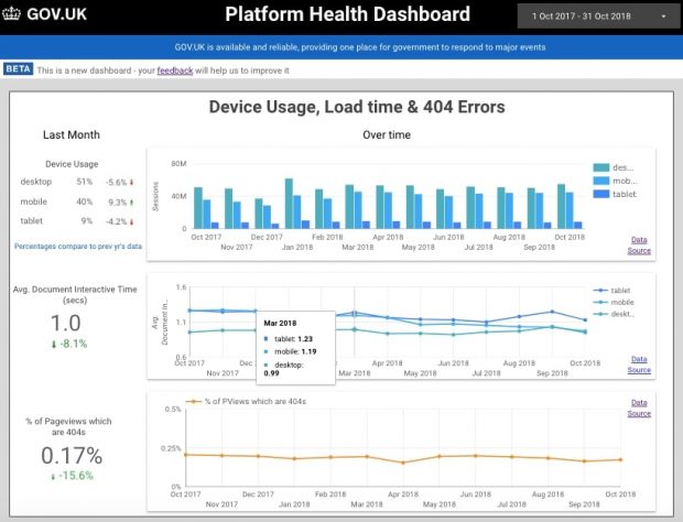
Data democratisation is a hot topic for analysts, especially those working in agile teams. AT Internet describes it as:
The process of democratising data means making data accessible to as many people as possible within a company. Decisions can then be made using data that’s tangible, easily understood and business-focused.
It’s a great vision - making data available so product managers and other decision-makers can self-service and freeing up analysts’ time to tackle more complex analysis. But the quotation continues with important caveats:
Data democratisation happens by sharing data in the right formats and channels, according to each user’s profile and level of knowledge.
So we decided to share how we’ve approached this by understanding teams’ user needs for data and what we’ve learned whilst working with these data sources.
Defining the scope
It’s important to meet the team to understand what they want to know, current data gaps and who will use the dashboard.
We’ve found it’s useful to access and review existing data sources in advance. But we’ve also found teams tend to have their own particular ways of using data, so it’s often necessary to discuss this from the start.
Some good questions to ask include:
- What will you use the dashboard for?
- What questions are you asking when you look at this data?
- Do we have access to all data sources?
- Do we have access to historical data?
- Who manages the data and who do we contact if there are problems with access/data sources?
- Who is the decision-maker and do we have one main point of contact?
Data sources
Some data can be accessed directly. For example, tools such as Tableau or Google Data Studio have connectors that link directly to Google Analytics, BigQuery, Search Console and more. However, many teams keep records of their work on a spreadsheet. It’s worth getting a list of these, together with any older spreadsheets for backfilling data.
Connecting sources directly can make the dashboard more resilient, as it reduces the amount of dependency on other people updating or even breaking a spreadsheet. When being pointed to data sources, ensure the team gives you logins, not just for the software, but for any views and APIs.
Cleansing and tidying the data
As analysts, we frequently need to identify and resolve issues before we can work with or present data, for example:

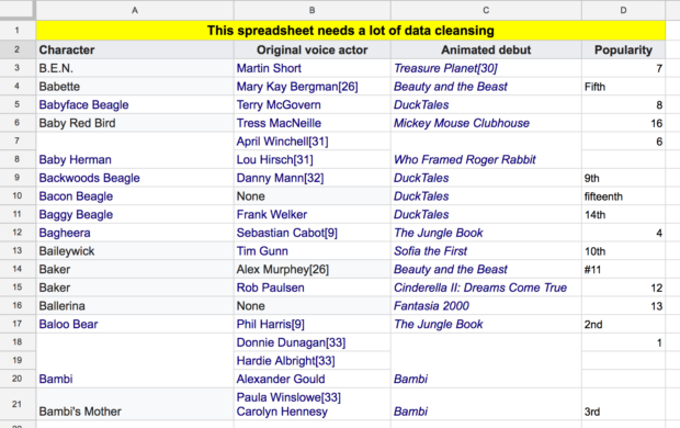
Inconsistent labelling
This is every analyst's nightmare. You’ll need to use tools like ‘Find and Replace’ to resolve this.
Multiple items in one cell/column
This is also not uncommon. One solution is to use the ‘text to columns’ function to separate text.
Multiple formats in one column
This can also be a major issue which is worth identifying early on. For example, a team we worked with recorded the amount of time spent on a project in many different ways. Some people wrote hours and minutes (04:00), some people used text (4 hours), and some people wrote out a long form answer (one day and two hours).
To reduce this problem in the future, engage with the team to change spreadsheets so that the data can be easily managed. For example, build in data validation so that users can only enter values from a controlled list.
Text Only Tables
Some teams may collect textual information in a spreadsheet. For example, they might log the staff member, the team, the location, organisation or meeting topic.
To turn this into data that you can visualise, you can use a COUNTA formula to count the occurrences of each, i.e. how many times did ‘red team’ appear.
Tables with multiple headings / incorrect headings
This is also a common issue in data collection. Dates must be in one column to build charts showing data over time, but you may be given a table with dates across the top, with one column for each month.
There are no easy solutions to this problem. You may be able to copy and transpose the table, which turns the top row into the left-hand column. However, this will mean data is not automatically pulled into the new table correctly.
The American Statistician has published a really helpful guide called Data Organisation in Spreadsheets.

Working with the data
As discussed earlier, it’s best to use connectors to link directly to data sources like Google Analytics. This reduces error and the need for manual updates. However, we’ve found that when data is held in a series of spreadsheets, there is great value in pulling all the data into one master sheet, so you can see missing data at a glance.
Where possible, use a formula, such as IMPORTRANGE in Google Sheets, to pull data automatically into a new spreadsheet. If you pull each sheet of data onto a separate tab in your own sheet and then pull the relevant bits of that data on to one tab in your spreadsheet, this will make the dashboard easier to build and more resilient.
If you're building a dashboard in Google Data Studio, here’s a tip for presenting charts based on dates: create a ‘date’ column on the left-hand side of the master spreadsheet and then add a ‘month’ column next to it, with the date formatted as month/year. Use this second column as the date field in your charts.
Automatic updates
To make your dashboard more sustainable, minimise the amount of manual intervention to reduce effort and errors. Try to do the following:
- connect to sources that update automatically, such as Google Analytics
- set reports to run regularly and for a sensible period into the future
- as you build a sheet which pulls in data, for example using IMPORTRANGE, make sure the ‘date’ column is populated for a sensible period into the future
- encourage teams you are working with to use as few spreadsheets as possible and help them format data consistently and cleanly
So now we should have data sources that are clean and able to be visualised.
In a future post we’ll describe how we’ve gone on to build dashboards that meet team’s needs, are easy to understand and maintain and that people want to use.
Please do add your own tips for building great dashboards in the comments below and subscribe to this blog to receive updates when new posts are published.
4 comments
Comment by Dawn posted on
Thanks for sharing and working openly, looks great.
I'd be very interested in reading a follow up post on how you ensured the dashboards met the user needs, how you did testing and how you modified dashboards in response to feedback.
Comment by Neil Good posted on
Me Again - Lizzie is right - the Unpivot function is the one to use....
Comment by Lizzie Ellis posted on
To add another comment to the column per month issue - I was helping another team recently with a Power BI dashboard. Their input data was an Excel file that had a new month/year column added to it each month without removing any of the other columns, so the number of numeric columns increased each month. This meant that each month you would have to modify the code to accommodate the next month/year column. Very tedious!
In PowerBI I discovered there is an option called 'unpivot other columns'. This allows you to select the columns you know will never change (date, category, user, etc.) and ask PowerBI to always pivot any other columns. This meant the team could simply refresh the report after updating their input file without having to update any of the process/code within the report.
There may be similar functionality in other dashboard software.
Comment by Mr Neil Good posted on
Thanks for this.
To your comment about having data in multiple columns rather than a column with the heading - a column per month is a favourite of my Finance colleagues.
Power BI has the nifty Transpose feature which I have used extensively already to organise the data as you describe above!