This posts outlines our steps to producing web heatmaps with the help of Google Analytics. It follows my recent post on how heatmaps can show how users navigate around GOV.UK.
Heatmaps are reports that show what parts of a webpage are looked at and clicked on. They are often used to compliment other web analytics data, giving data scientists a full view on how certain content is performing.
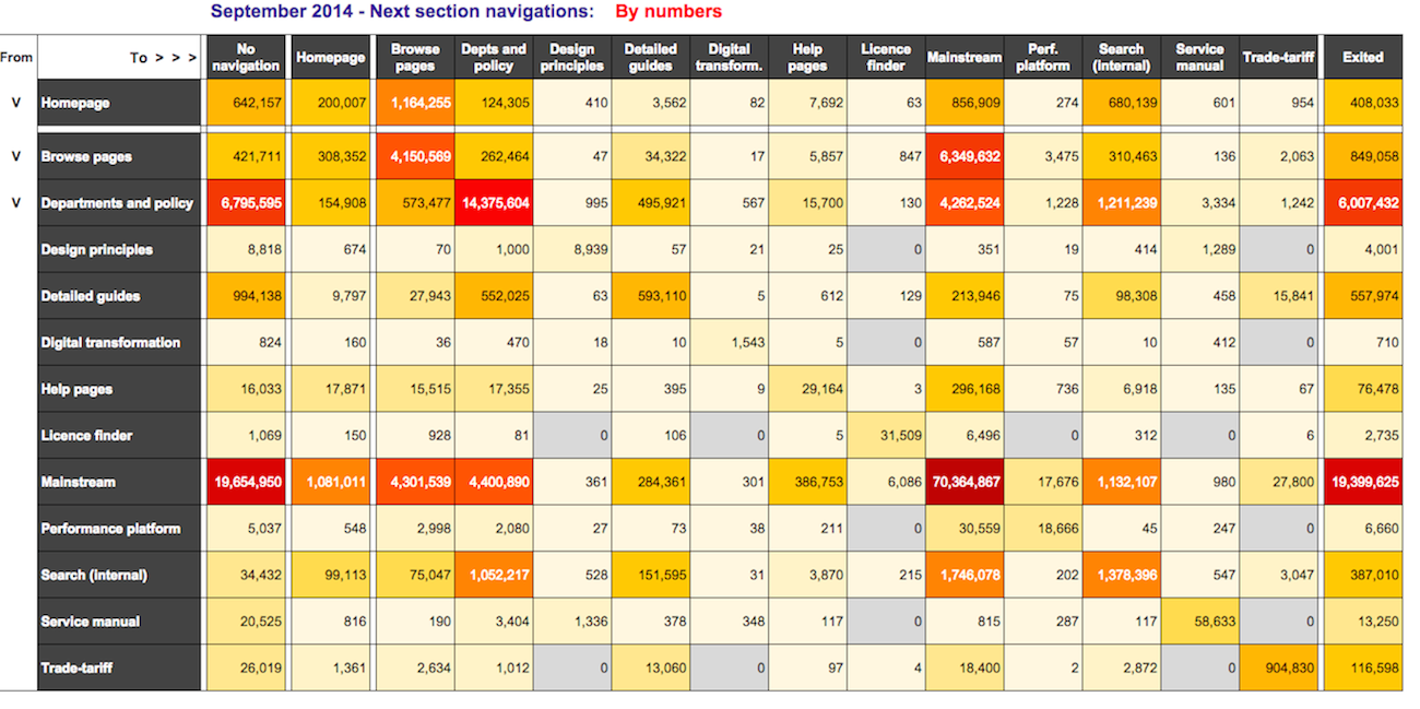
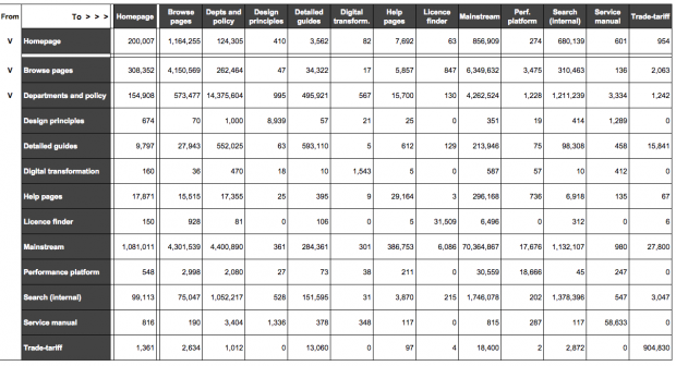
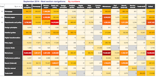
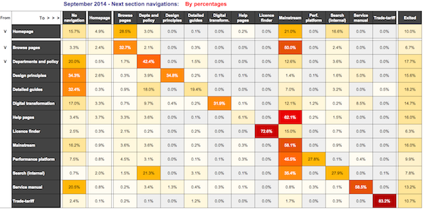
The heatmaps below represent every user navigation made on GOV.UK in September 2014 from one section to another. The heading columns on the left show where users navigated from, while the headings rows at the top show where they went. The corresponding cells shows the approximate number of times they made a particular journey, with the different colours portraying the journey's relative frequency. The ‘hotter’ or darker the colour, the more times the journey took place.
Click on the images below to view the full versions of the heatmaps.

Sectioning the site
I first identified the main content sections on GOV.UK. Most of these top-level sections could be determined by their URL structure or page title. However, a popular section of GOV.UK focuses on the general needs of citizens and businesses. This ‘mainstream content’ doesn’t have an identifier in the URL or page title, but it was reasonable to assume it would make up the majority of remaining top-level pages.
Setting up filters
Then to create the heatmap report, I set up a new View in Google Analytics to track how users were navigating the top-level sections.
I made a series of filters to aggregate all the pages within a top-level section. These were then displayed in Google Analytics under a recognisable name.
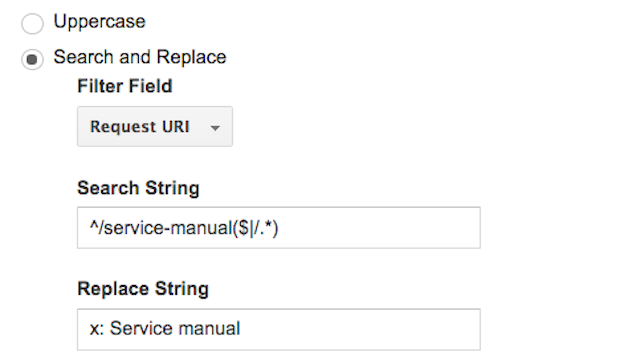
For example, we have a section called the Government Service Design Manual in which all the pages begin with /service-manual in the URL. The custom filter configuration to group these manual pages together is:
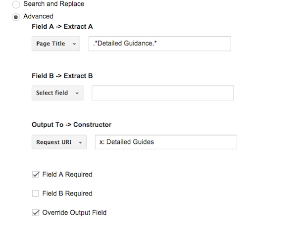
We have content called detailed guides which are only identifiable by the page title (all contain the label ‘detailed guidance’).
I used this advanced filter configuration to aggregate them together:
The reason I included ‘x:’ in the naming of the aggregated pages is to enable mainstream content pages to be included. To then aggregate mainstream content pages I created this filter:
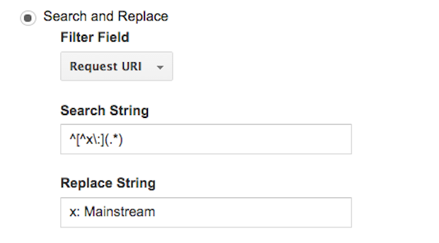
This filter tells Google to find any remaining pages that don’t start with ‘x:’, group them together and call them “x: Mainstream”.
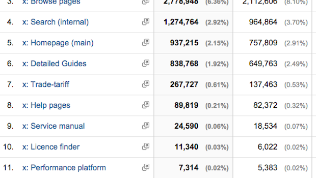
Once the filters became active, here’s how the data appeared in the All Pages report:
After making some checks to ensure the data was appearing correctly, I allowed the data to collect for the whole month of September.
Bringing the data together
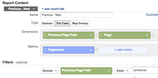
After a month’s worth of data had been collected, I produced a custom report that showed how many times a user navigated from one section of GOV.UK to another. Here is the configuration used:
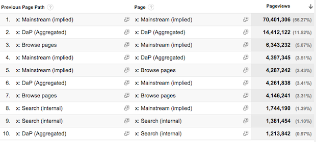
And this is how the custom report looked:
As we have a Premium account, I was able to request an unsampled CSV (comma-separated values) file in order to get exact figures. (Note: this is not a necessary step if the data has a high sampling rate, as it will then be quite representative.)
Pivoting the data
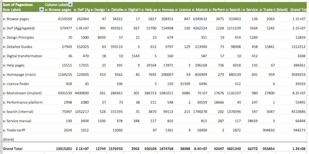
The next stage was to pivot the data in the CSV file to form the basic construct of the heatmap. I used the Previous Page Path dimension as Row Labels, the Page dimension as Column Labels and the Sum of Pageviews as Values. This was the resulting table:
Then I copied and pasted the table into a spreadsheet and tidied it up. I moved some columns, renamed the labels, formatted the cells and deleted anything that wasn’t needed. After this phase, this is what the table looked like:
Exit behaviour
To obtain a more comprehensive picture of navigations I wanted to include exit behaviour, which I decided to break down into 2 types. The first was ‘bounce’ exits, in which the user only looked at a single page and left; the other was exits made after looking at more than one page.
The overall number of exits per section was available from the standard Exits report. To get the bounce exits, I applied an advanced segment using Page Depth. Here’s the configuration:
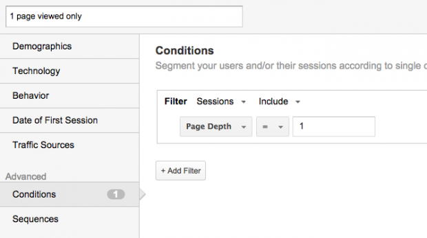
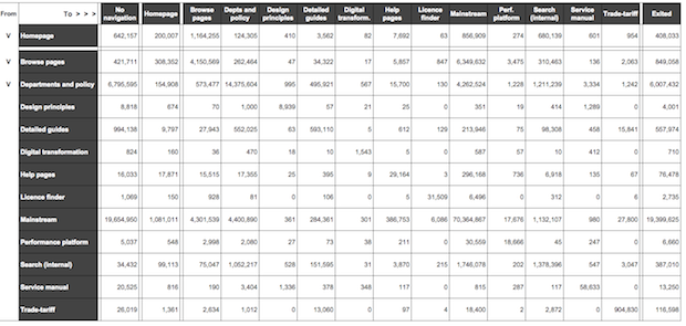
I entered the resulting numbers as a separate column in the far left of my table, and labelled it ‘no navigation’. These numbers were then subtracted from the overall exit figures to show the number of non-bounced exits.
I inserted a new column called ‘exited’ to the right of the table for these numbers. The table then looked like this:
‘Heating’ the cells
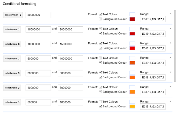
Now that all the data was in place, it was time to apply colour to show the relative differences between cells. I applied conditional formatting using a colour range from deep red (for the highest end of the scale) to a pale yellow (for the lowest). Zero values were greyed out.
Here’s part of the conditional formatting settings:
This is the resulting heatmap, with a title added:
Heatmap by percentages
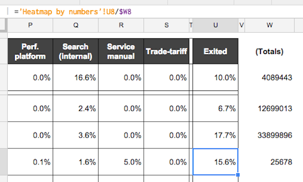
I used the heatmap as a basis for creating another one.
My second heatmap shows the percentage of navigations from each top-level section. This was achieved by simply adding the total number of navigations to each row in the table. Then I entered a formula to calculate the percentage of each of the individual cells in those rows.
Here's an example:
The completed heatmap:
Feedback
The heatmaps have given us intriguing insights into how users have been moving around GOV.UK. We'll continue to iterate them further, for example by segmenting them by device type.
In the meantime, if you have any comments or suggestions, or you want to share your experiences of creating navigational heatmaps, then please get in touch in the comments section below.
Ashraf Chohan is a Product Analyst at GDS.
If work like this sounds good to you, take a look at working for GDS. We’re usually searching for talented people to come and join the team.
Sign up now for email updates from this blog or subscribe to the feed.