Using a federated model for API discovery in government

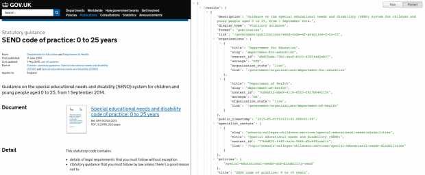
...are web interfaces for software. APIs are a great way to share data as and when it’s needed using agreed open formats, rather than copying and duplicating data in different...

...are web interfaces for software. APIs are a great way to share data as and when it’s needed using agreed open formats, rather than copying and duplicating data in different...
...content design, a cookie policy, open data, analytics, identity assurance; and design patterns; Removing the HGV levy logo; Ensuring support for java script; Taking forward arrangements for a skilled and...
...– one for ‘booking’, one for ‘changes’ and one presenting data that applies to our service as a whole. I find the Platform very useful for identifying trends –...
...see the service proceed to Beta. We look forward to the team sharing feedback from the user research trip to China when they return for Live assessment. Summary of Original...

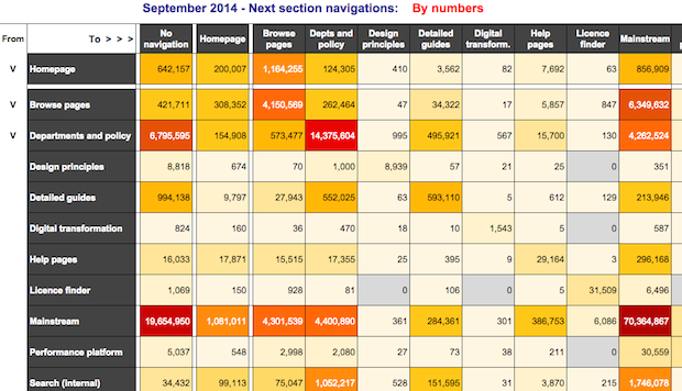
...applied conditional formatting using a colour range from deep red (for the highest end of the scale) to a pale yellow (for the lowest). Zero values were greyed out. Here’s...

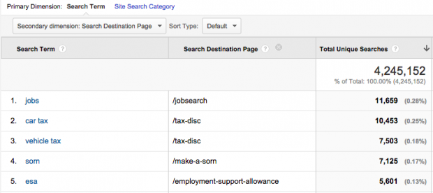
...is still available, but this just gives you the page path for each search query (‘/search’ for GOV.UK searches) rather than the next page after the search results. For years...
...provided access to their analytics for when the service is in public beta. The service mapping work will also enable the team to identify components of the user journey for...
...information for us to understand issues that users are having. This text data is hard to easily understand when viewed across a large number of pages. So for this we...
...is testing and iterating the service in response to a range of research inputs. Improvements and enhancements based on these inputs was well demonstrated at the assessment. Forward planning for...
...bulk to inform policy and operational planning. He tried out several open-source libraries for reading the XBRL data format, and had most success using the “XBRL” package for R. Work...