Building data dashboards that meet user needs

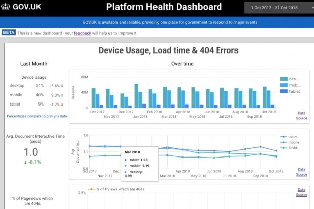
Data democratisation is a hot topic for analysts, so at the Government Digital Service we wanted to share how we’ve approached this by understanding teams’ user needs for data and what we’ve learned whilst working with these data sources.


